


Why Your Cyprus Business Needs a Digital Makeover Right Now
Transforming Digital Presence: The Essential Guide to Modern Web Design In…
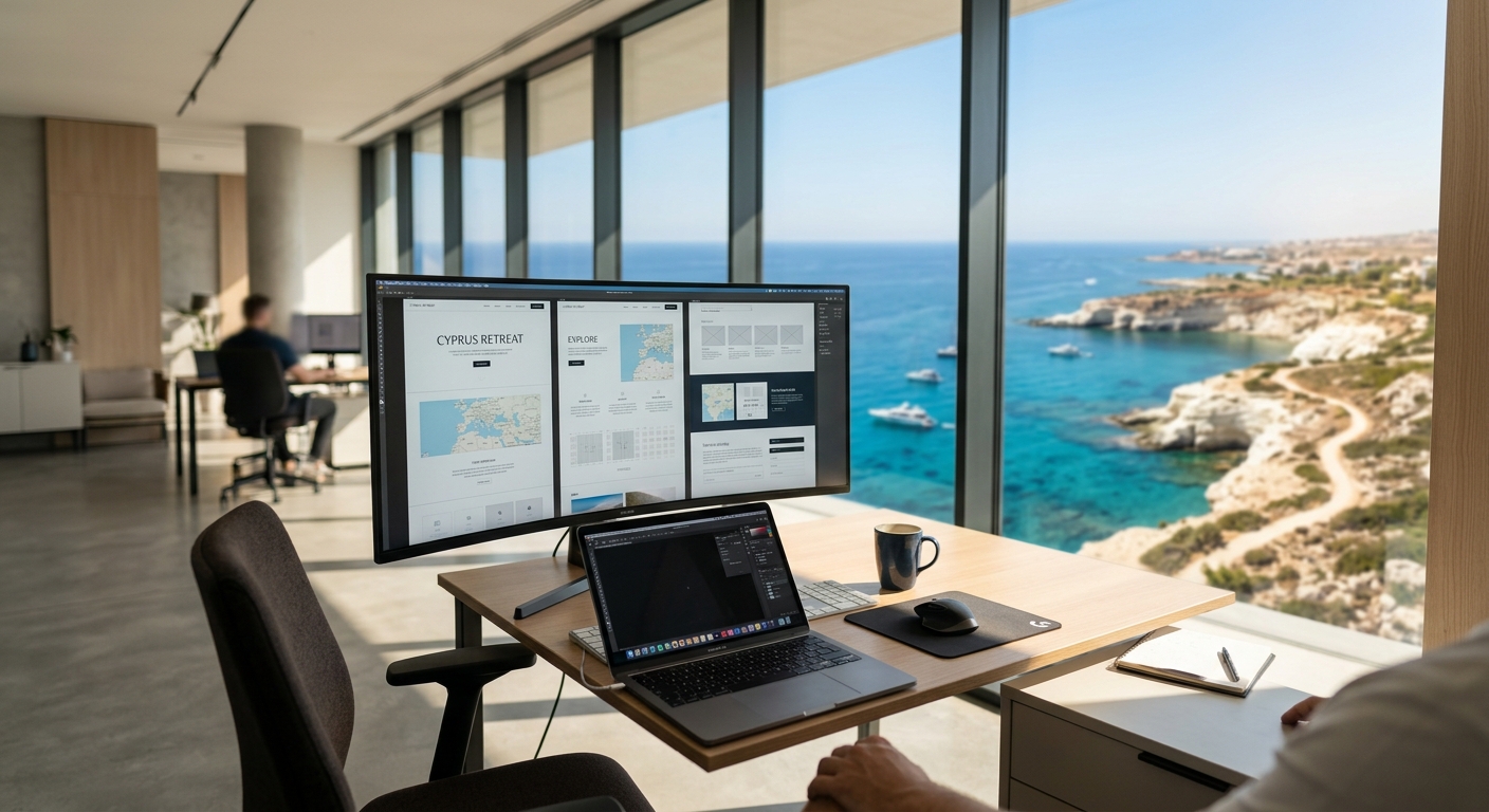
How Quality Web Design Transforms Cyprus Businesses in 2026
# Professional Web Design: Building Your Digital Presence in Cyprus The…
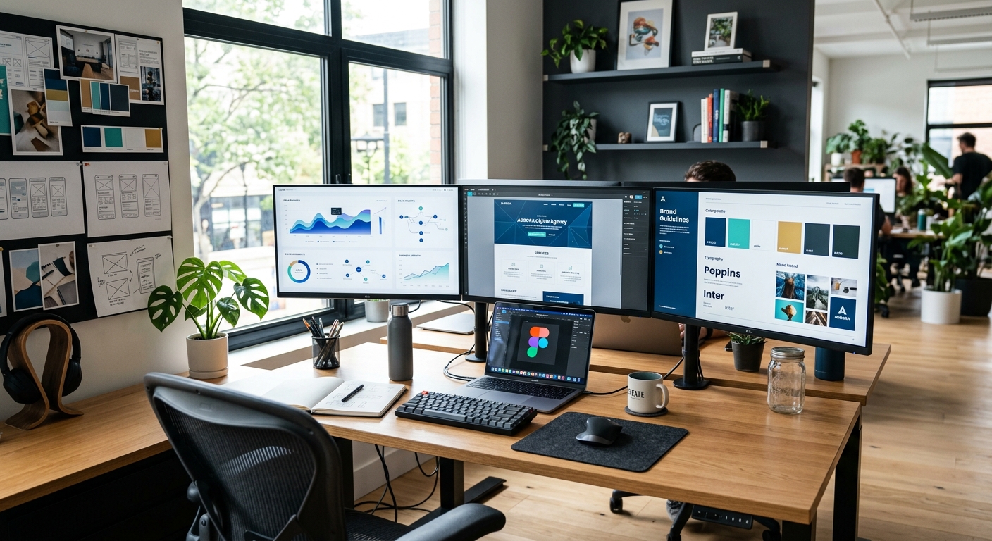
How Strategic Web Design Transforms Your Business Identity
Transforming Digital Experiences Through Strategic Web Design In an…

10 Signs Your Business Website Needs a Redesign
Your website is often the first impression a potential customer has of your…

Why Your Website Isn't Generating Leads (And How to Fix It)
You paid for a website. Maybe you even paid a decent amount. It looks…
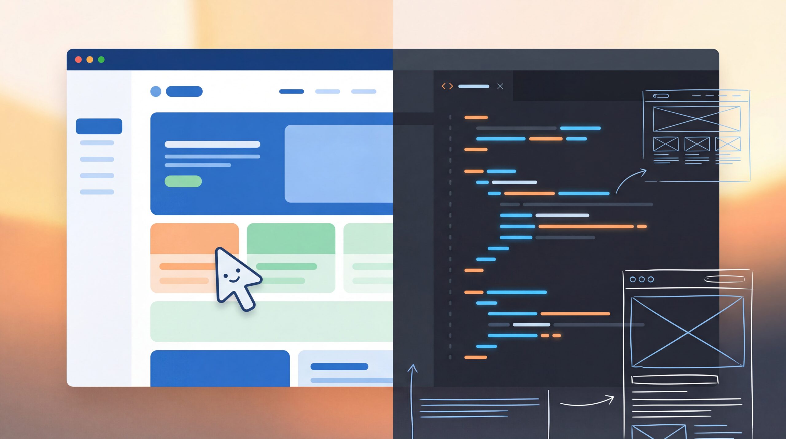
WordPress vs Custom Website: Which is Right for Your Cyprus Business?
When it comes to building a website for your Cyprus business, you'll quickly…

How Much Does a Website Cost in Cyprus?
If you've ever searched for "website cost Cyprus" online, you've probably been…

Mobile-First E-Commerce: Designing for the On-the-Go Shopper
Photo by Matthew Henry from Burst In today's fast-paced world, where…

Learn how consumers can have a better shopping experience on your e-shop
Photo by Mark König on Unsplash The goal of every store owner is for their…